Exposition
Briefing
Dynamik Sports is a sporting goods store located in Reading, MA. They specialize in hockey goods but also offer baseball, lacrosse, and soccer products. They currently have a website but it lacks an e-commerce functionality.
Objectives
- Add an intuitive, e-commerce functionality
- Discover customer priorities
- Make it effortless to find any product without the search bar
- Tailor the UI to draw in the target audience
Discovery
What do real customers want most?
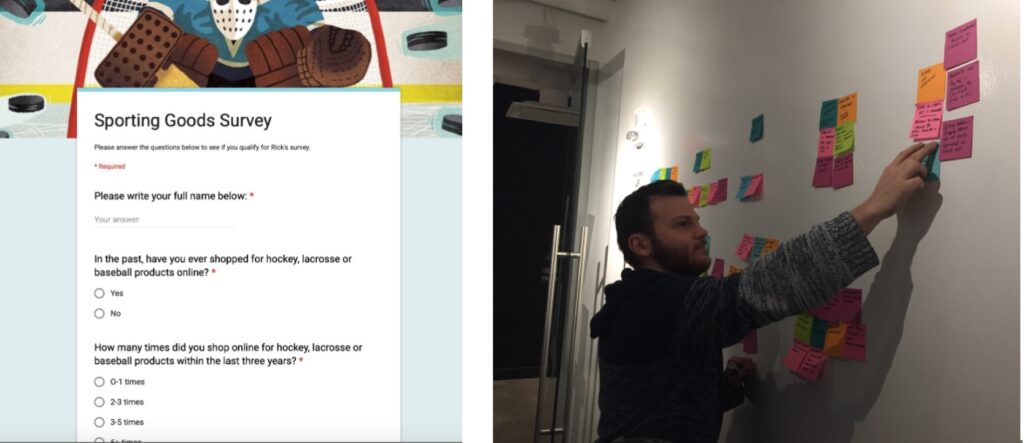
Notable interview quotes:
“Enjoys the process of shopping online when time is limited, quick, it’s easy”
“The most important aspect to shopping online is the product info, product reviews, why reviews are presented because I get the sense that visiting national brands that the reviews are curated”
“Had a negative experience with Amazon, I don’t like how the buy now button is too close to other options. I hit it by accident, then I had to cancel the order.”
“It takes too much work to find what I’m looking for and would be nice if things were grouped better.”
Bottom line – Customer insights
Customers were very reluctant to buy equipment online because they couldn’t try on the equipment to test comfort, how it looked on them, range of motion, and amount of protection.
To break down this barrier it was essential to include:
- An excellent return and refund policy
- The exact dimensions for all items
- Reviews and photos from actual customers using/wearing gear
- If the product was wearable, then include the reviewer’s body dimensions like height and weight using the product.
- 360-degree views of the product
Analyzing the competition
I searched lots of direct competitors, sites selling similar products, manufacturer’s websites, and even sites for NHL teams all to get a feel for what pops and stands out to target customers.
I ultimately wanted to learn what competitors both big and small are doing well, if they do anything differently, what design choices they made and what could they do better.
All this information would soon go into the ultimate digital experience for purchasing sports equipment.
Key finding: I loved Pure Hockey’s real-time filter options to quickly hone in on the products that fit your needs. I could tell they prioritized filter options. In general, this is one of my favorite things on any e-commerce site.
Card sorts
Goal: Optimize information architecture with no need for the search bar
Users don’t always know exactly what they’re looking for so the search bar won’t always help them. Categorization is very important and often overlooked in every user experience. Let’s say a user wants to search for tools to help them train, they can find these products easier by going to the proper hierarchy of categories.
To determine the optimal organization, I went to the best resource available: the users themselves. I utilized two different card sorting methods for this process. My process is explained more below:
Open card sorts
To determine how to group the different store items, I started with an open card sort. After six different tests, I found:
- There were two different groups of like-minded people. Half of my users created 25 categories while the other half created seven categories
- To reduce this polarization among users, I decided to conduct some closed card sorts with categories selected from both groups.
Closed card sorts
To create my categories for the closed card sort, I:
- Reviewed by results from the original six sorts
- Conducted the open card sort myself to better understand the process. Realized one group was very broad while the other group was very specific. I decided to use 16 categories as a middle-ground.
- For closed card sorts, I had three participants. My categories made sense to my users based on strong correlations in my data.
Site Map
Now that the products were optimally categorized, I created a site map to visualize the site’s structure.
Design time
User Flow
Wires, user feedback & design choices
Feedback One user was not sure when a product was or wasn’t added to the shopping cart. There was a red circle that popped up over the shopping cart, however they did not notice this change.
Solution A transparent box that says the item was added to the shopping cart after she clicked on add to the shopping cart. It gives instructions on how to get to the cart as well. Can click out by pressing okay.
Feedback Some users were not sure how to view different product reviews right away. They did eventually find the left and right buttons to view different reviews but they typically like seeing a few different reviews at a time.
Solution I changed the product review page to show three different reviews at once. If a user wants to see detail about the review then they can click on specific reviews to see more.
My users thought the checkout screen was confusing because everything on the page was packed in. Ultimately there was not enough white-space and users felt confined.
Solution This problem was solved by adding more white space between everything on the page.
Potential next steps
I’d love to get back in here to bring every wireframe into a high-fidelity state.
The checkout experience needs some key improvements which I’d be happy to walk you through via interview.